Monterey Popsicle NF font
By Nick Curtis at Aug 28, 2018monterey-popsicle-nf.zip (0.03Mb)
Archive: 3 file(s)
| monterey-popsicle-nf.regular.ttf | 28.1 Kb |
| monterey-popsicle-nf.regular.otf | 27.0 Kb |
| monterey-popsicle-nf-eula.txt | 2.1 Kb |
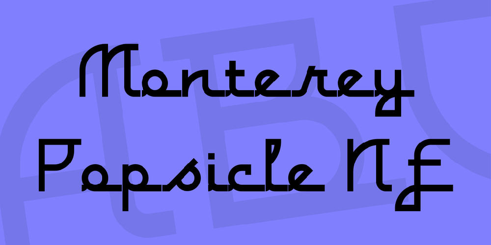
Just another “somewhere from the thirties to the fifties” kinda script, named kinda after a sixties rock festival.
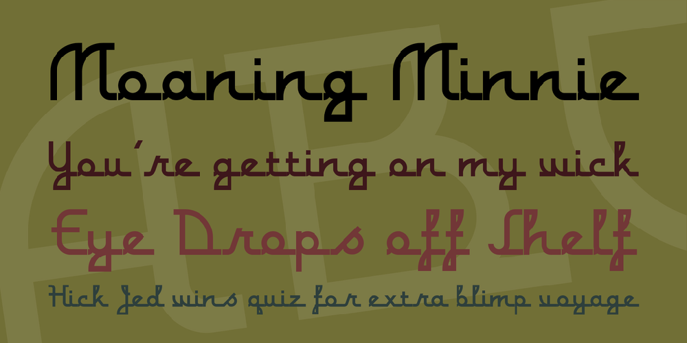
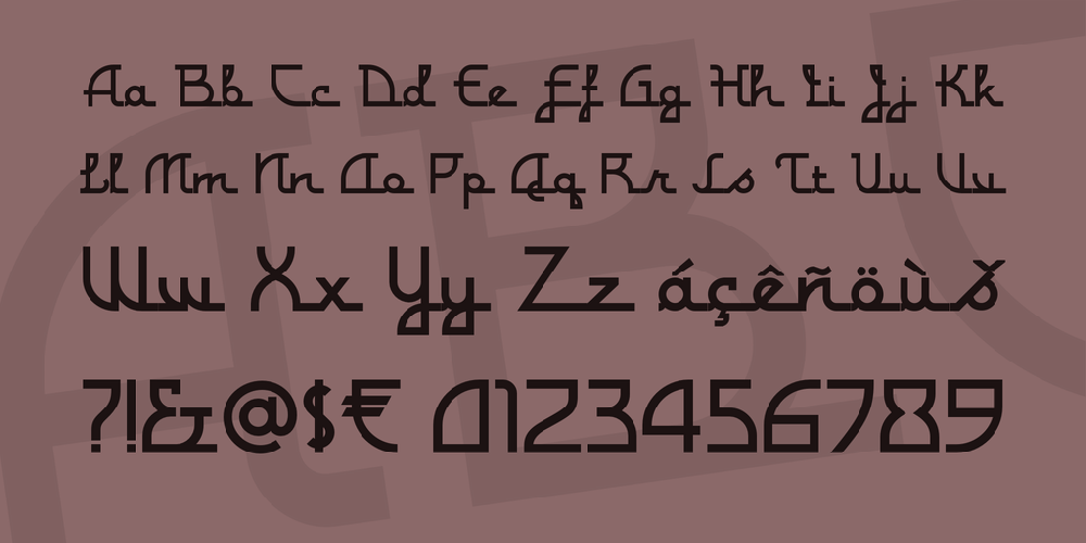
For the commercial font I have totally reworked all the letterforms: they started with a “notch” and ended flat - I have removed the “notch” and rounded off the ending stroke, so now you can actually start words with the lowercase letters. I have also improved the spacing (especially after the capitals), and of course added all the “foreign” glyphs. A classic is reborn!
For the commercial font I have totally reworked all the letterforms: they started with a “notch” and ended flat - I have removed the “notch” and rounded off the ending stroke, so now you can actually start words with the lowercase letters. I have also improved the spacing (especially after the capitals), and of course added all the “foreign” glyphs. A classic is reborn!
monterey-popsicle-nf.zip (0.03Mb)
Archive: 3 file(s)
| monterey-popsicle-nf.regular.ttf | 28.1 Kb |
| monterey-popsicle-nf.regular.otf | 27.0 Kb |
| monterey-popsicle-nf-eula.txt | 2.1 Kb |


