Whatacolour font
By V at Dec 05, 2018whatacolour.zip (0.46Mb)
Archive: 3 file(s)
| Whatacolour-055.otf | 920.4 Kb |
| Whatacolour-055s.otf | 62.3 Kb |
| whatacolour.txt | 3.3 Kb |
Download Free for Personal Use only Donate
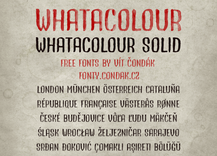
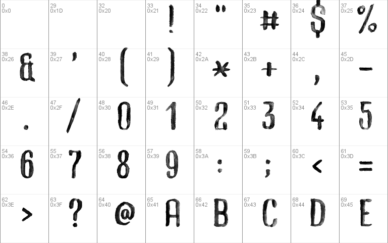
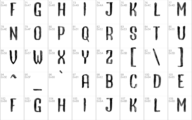
I generally prefer simple fonts with as few points as it's possible but this time I decided to create a font emulating shades of grey and it requires a lot of points.
Creating the original design with a brush, watercolours and paper was rather fast and easy but then I spend more than a month experimenting with different approaches and programs to get the best result. In the end I wrote my own converting tool and after a lot of manual tweaking I finally end up with a font that's under 1 MB.
It's still rather big and slow but it's much better than my previous prototypes. =)
fonty.condak.cz/detail.php?font=whatacolour
Website: http://fonty.condak.cz
whatacolour.zip (0.46Mb)
Archive: 3 file(s)
| Whatacolour-055.otf | 920.4 Kb |
| Whatacolour-055s.otf | 62.3 Kb |
| whatacolour.txt | 3.3 Kb |
Download Free for Personal Use only Donate


