Tip Of Hell font
By Pallor Publishing at Nov 12, 2019tip-of-hell.zip (0.02Mb)
Archive: 1 file(s)
| Tip Of Hell.ttf | 27.6 Kb |
Download Free for Personal Use only Donate
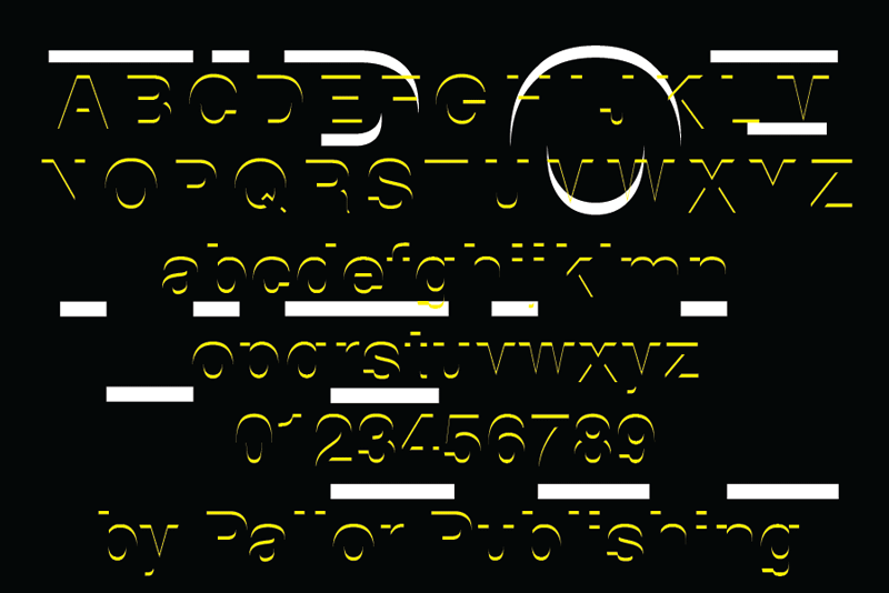
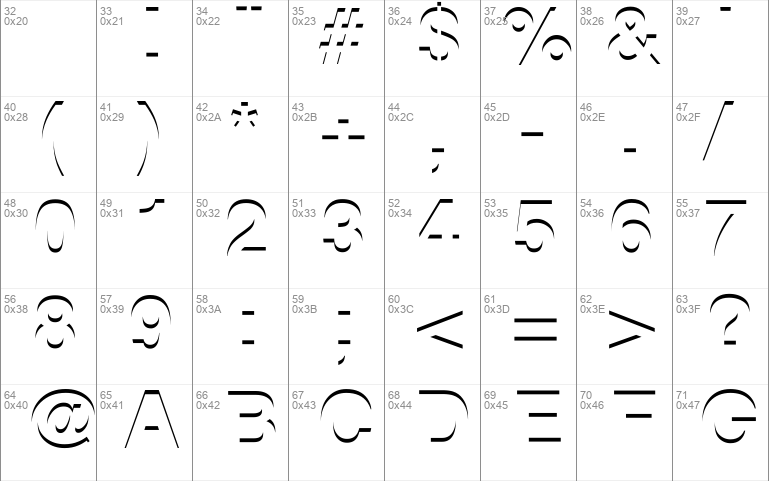
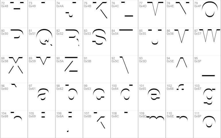
Tip Of Hell exposes the very tips of Helvetica Bold. It was designed by using a very easy effect that designers can create quite easily. This font isn't designed to be useful in all situations. It does, however, have a creepy kind of feel to it, and is surprisingly readable in certain situations. It is simply, for bettor or worse, the literal Tip of Hell.
Website: http://www.pallorpublishing.com
tip-of-hell.zip (0.02Mb)
Archive: 1 file(s)
| Tip Of Hell.ttf | 27.6 Kb |
Download Free for Personal Use only Donate


