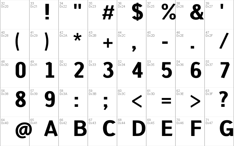
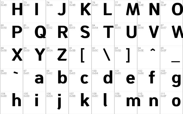
Shinokai-Bold font
By Lukas Schiltknecht at Oct 26, 2018shinokai-bold.zip (0.11Mb)
Archive: 4 file(s)
| Shinokai-Bold.otf | 71.9 Kb |
| Shinokai-Bold.ttf | 53.7 Kb |
| Shinokai.otf | 77.1 Kb |
| Shinokai.ttf | 59.3 Kb |
Download Free for Personal Use only Full version
Shinokai Font Family $27 | 2 x TTF and OTF
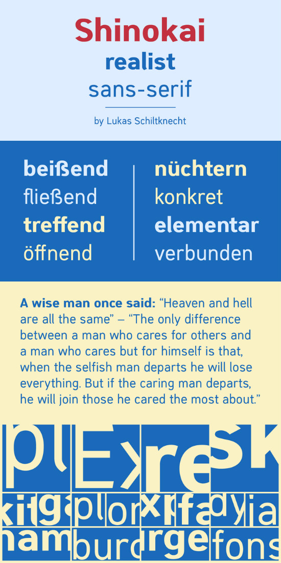
The Shinokai is a sans serif of two weights that is both dynamic and consequent. Originally concepted as a font for application letters by Lukas Schiltknecht it quickly became a more sophisticated piece of work. This Typeface is inspired by some of his favorite fonts the FF DIN and the ITC Officina.
It is made to suit a variety of uses like advertising and packaging, film and tv, editorial and publishing as well as posters and billboards.
shinokai-bold.zip (0.11Mb)
Archive: 4 file(s)
| Shinokai-Bold.otf | 71.9 Kb |
| Shinokai-Bold.ttf | 53.7 Kb |
| Shinokai.otf | 77.1 Kb |
| Shinokai.ttf | 59.3 Kb |
Download Free for Personal Use only Full version


