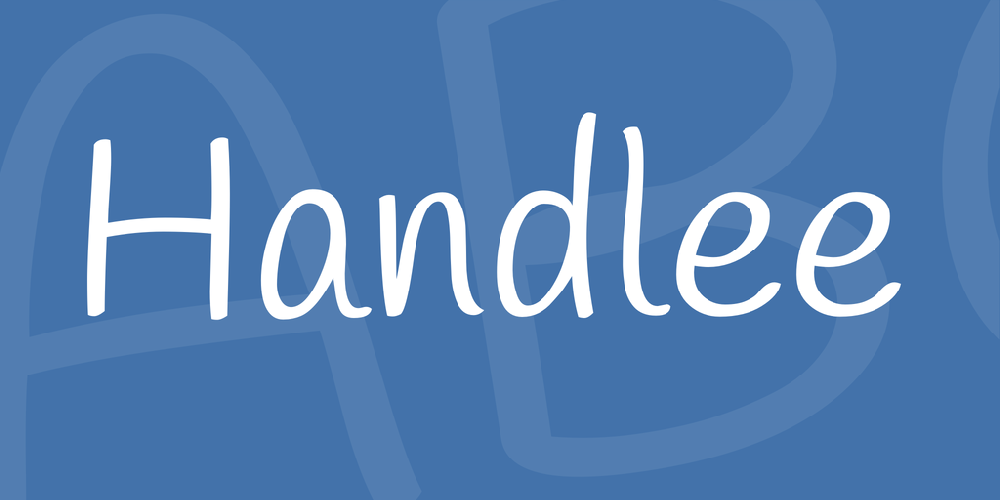
Handlee font
By Joe Prince at Aug 31, 2018handlee.zip (0.02Mb)
Archive: 2 file(s)
| handlee.regular.ttf | 38.2 Kb |
| OFL.txt | 4.4 Kb |
Download Free for Personal Use only Full version
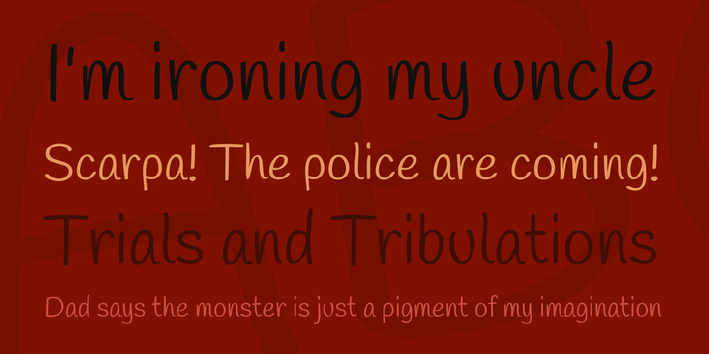
Handlee is loosely based on the handwriting of typographer Joe Prince. Its inconsistent curves give it a nice, human-like quality that is reflected in the characters. Each glyph is stationed at a different position in respect to the baseline, and ascenders and descenders vary, which all contribute to the human-like qualities of the font.
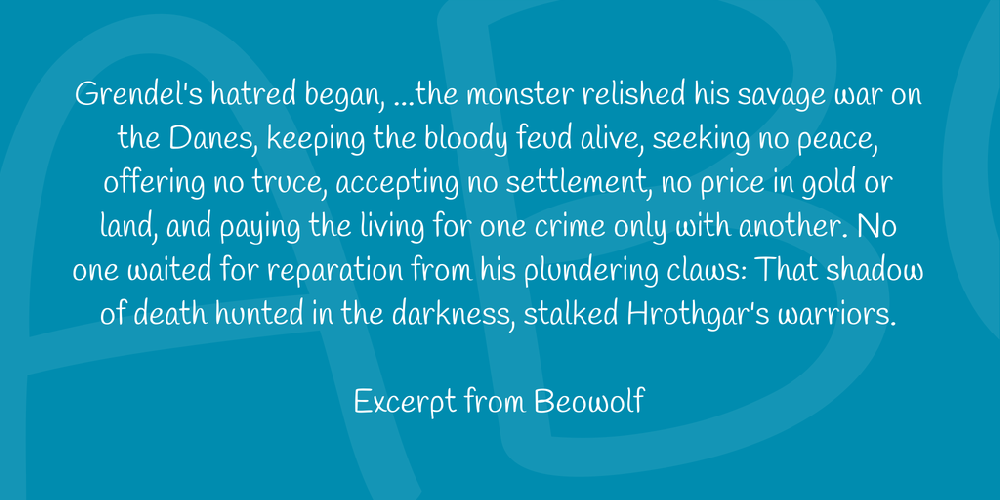
Handlee is a great font for any web page looking to add some personality and charisma. There was careful attention to detail in removing unnecessary overlap between letters, which allows Handlee to be scaled down to very small sizes while still maintaining legibility.
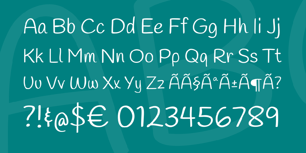
The diaritics were purposefully designed at a slightly larger scale than normal to add to the ability to be scaled down. Also, the accents on the accented characters were not automatically generated but were rather hand placed individually to portray asymmetry and inconsistency that is typically found in handwriting.
handlee.zip (0.02Mb)
Archive: 2 file(s)
| handlee.regular.ttf | 38.2 Kb |
| OFL.txt | 4.4 Kb |
Download Free for Personal Use only Full version


