
Antelope H font
By Tom Murphy 7 at Aug 24, 2018antelope-h.zip (0.02Mb)
Archive: 2 file(s)
| antelope-h.regular.ttf | 25.0 Kb |
| readme.txt | 2.9 Kb |
Download Free for Personal Use only
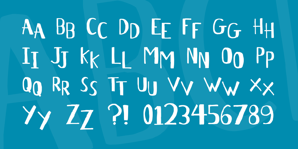
(Lower/Caps [see below], Numbers, some Punctuation/Special) is my Top-hat style Headline font (thus the 'H'). To get the font to look staggered, as at left, you alternate uppercase and lowercase: AnTeLoPe H. You can also use straight caps or lowercase to get a more even look. I may eventually do a lowercase set and make a regular 'Antelope'. Hand hinted!

antelope-h.zip (0.02Mb)
Archive: 2 file(s)
| antelope-h.regular.ttf | 25.0 Kb |
| readme.txt | 2.9 Kb |
Download Free for Personal Use only