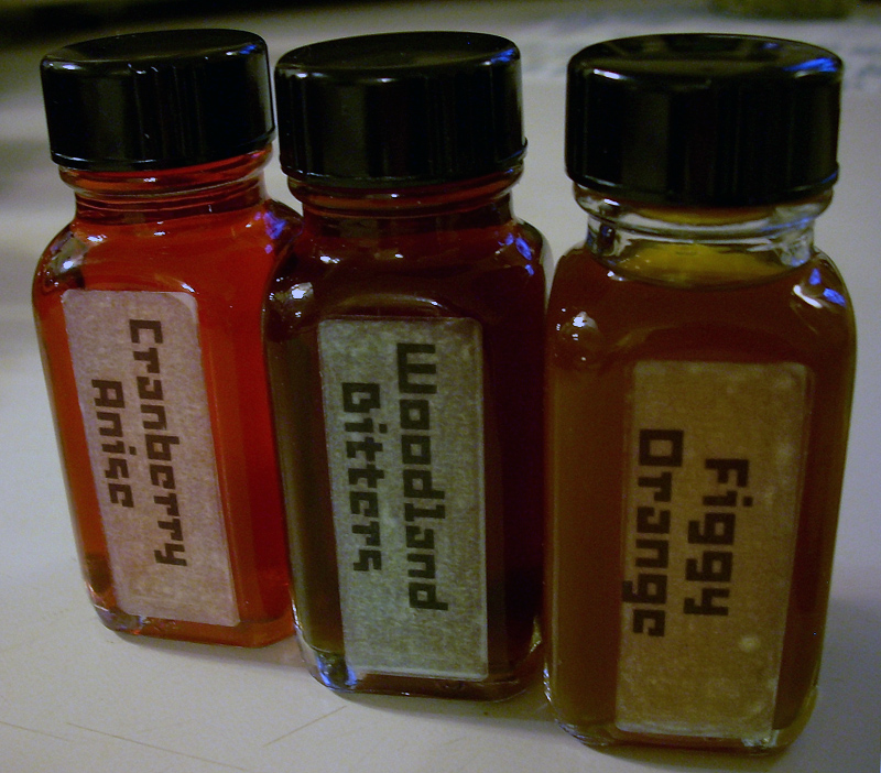
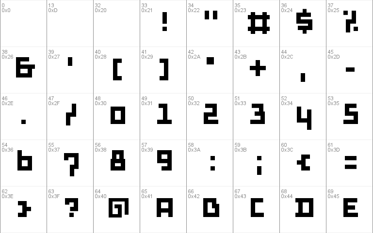
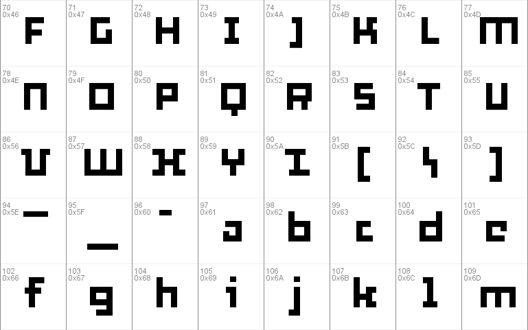
Thirtysix font
By Peter Van Lancker at Sep 06, 2018thirtysix.zip (0.01Mb)
Archive: 1 file(s)
| Thirtysix.ttf | 24.7 Kb |
Download Free for Personal Use only Donate
Constructed on a grid of 25/1000, or about six times more refined than the "six" font http://www.dafont.com/six.font. As the rhythm is 6 times weaker, there is 6 times more room for detail? "Proving" that character-timed rhythm can hardly be a factor of legibility.
Website: http://www.flickr.com/photos/petervanlancker/
thirtysix.zip (0.01Mb)
Archive: 1 file(s)
| Thirtysix.ttf | 24.7 Kb |
Download Free for Personal Use only Donate


